
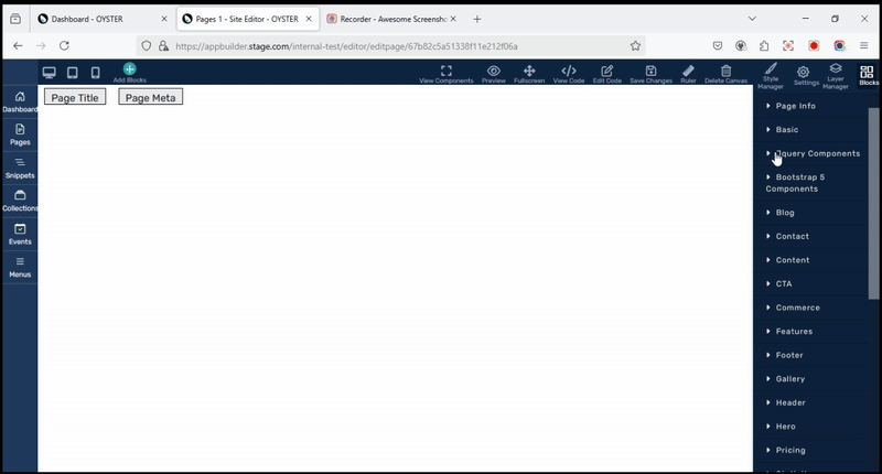
Jquery Components
The JQuery Components section in the OYSTER page builder provides a collection of interactive UI elements that can be added to a webpage through a simple drag-and-drop interface. These components enhance user experience and functionality without requiring extensive coding. Below is a detailed explanation of each component, its purpose, and its functionality.
1. Calendar
Purpose:
The Calendar component provides a date selection interface, allowing users to pick a date from a visually interactive calendar instead of manually entering it.
Functionality:
- Displays a pop-up calendar for date selection.
- Reduces input errors by enforcing a structured date format.
- Used in forms, scheduling, and booking applications.
2. Button
Purpose:
A Button component is an interactive element that triggers an action when clicked.
Functionality:
- It can be customized with different labels, colors, and icons.
- Supports JavaScript functions for various actions such as form submission or navigation.
- Used in web forms, dialogues, and user interaction areas.
3. Buttonset
Purpose:
A button set groups multiple buttons together, making them behave as a single control unit.
Functionality:
- Used to create sets of mutually exclusive options (like radio buttons).
- Ideal for editor toolbars, format selection, and multi-button actions.
4. Checkboxradio
Purpose:
This component provides checkboxes and radio buttons for selection input.
Functionality:
- Checkboxes allow multiple selections.
- Radio buttons allow only one selection from a group.
- Used in surveys, preference settings, and option selections.
5. Controlgroup
Purpose:
A control group is used to group related UI elements together for better organization and accessibility.
Functionality:
- Groups elements like text fields, buttons, and dropdowns.
- Used in login forms, search bars, and grouped settings.
6. Dialog
Purpose:
A Dialog component is used to create pop-up windows that display messages, forms, or interactive content.
Functionality:
- Can be modal (blocking background interaction) or non-modal.
- Used for alerts, confirmations, and input forms.
7. Menu
Purpose:
A Menu provides a structured navigation system.
Functionality:
- Supports hierarchical menus with submenus.
- Used for website navigation, dropdown lists, and UI controls.
8. Progressbar
Purpose:
The progress bar visually represents the completion of a task.
Functionality:
- Displays a loading bar that updates dynamically.
- Used in file uploads, form submissions, and task completion indicators.
9. Select menu
Purpose:
A Select menu enhances the default dropdown selection element with improved styling and interaction.
Functionality:
- Allows users to select an option from a drop-down list.
- Used in form fields, preference settings, and dropdown navigations.
10. Slider
Purpose:
A Slider allows users to select a value within a range by dragging a handle.
Functionality:
- It can be used for price selection, volume control, or adjusting settings.
- Provides smooth user interaction for numeric inputs.
11. Spinner
Purpose:
A Spinner component is a numeric input field with increment and decrement buttons.
Functionality:
- Restricts input to numeric values only.
- Used in quantity selectors, date pickers, and counters.
12. Tabs
Purpose:
Tabs allow content to be organized into multiple sections where only one section is visible at a time.
Functionality:
- Enables efficient content management without cluttering the UI.
- Used in settings pages, dashboards, and content-heavy applications.
13. Tooltip
Purpose:
A Tooltip provides additional information when users hover over an element.
Functionality:
- Displays contextual hints or descriptions.
- Used in form fields, icons, and instructional UI elements.
14. Accordion
Purpose:
An Accordion component is a collapsible panel that expands to reveal content when clicked.
Functionality:
- Saves screen space by displaying only relevant information at a time.
- Used in FAQs, product descriptions, and collapsible menus.
15. Autocomplete
Purpose:
An Autocomplete component provides real-time suggestions as users type in an input field.
Functionality:
- Fetches and suggests matching data dynamically.
- Used in search bars, address forms, and data entry fields.
Conclusion
However, these JQuery components enhance the interactivity and usability of web applications by providing a wide range of UI elements that can be easily integrated into web pages. By leveraging these components, developers can create more intuitive and responsive user interfaces without extensive coding.