
Responsive view editor
The Responsive View Editor is an integral part of the Web Editor in the Oyster Application Builder, designed to help users create web pages that look and perform flawlessly across devices of all sizes. With its powerful tools and visual interface, the Responsive View Editor ensures that your application delivers a consistent and optimized user experience on desktops, tablets, and mobile devices.
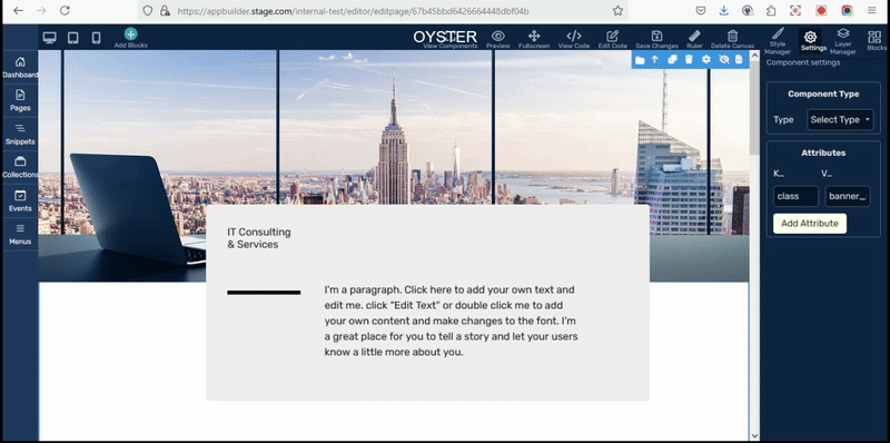
You can select your screen size from the top left corner and make changes for the selected screen. Web editor ensures that whatever changes you make in the selected screen it will not affect other screen styles.